Optimize your website for mobile users is important. People check websites on their phones more than on computers. If your website does not work well on a mobile device, you can lose visitors. Mobile optimization is essential. First, use a responsive design so it fits all screen sizes. Then, keep loading time fast by compressing images and using fewer plugins.
Next, make buttons and text easy to tap and read. Furthermore, remove pop-ups that block content. Lastly, test your site on different devices. A mobile-friendly website improves user experience and boosts search rankings.
Table of Contents
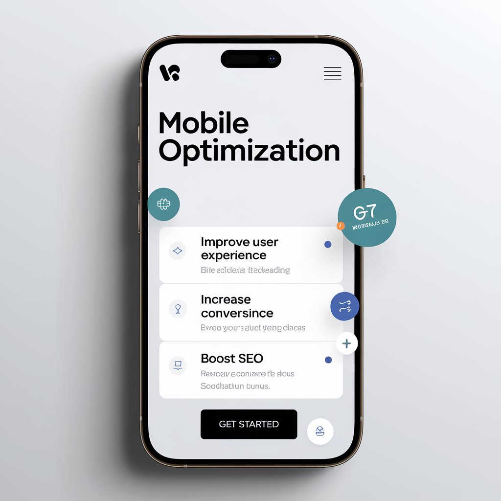
What is Mobile Optimization?
Mobile optimization means making your website look and work great on phones and tablets. It adjusts the layout, images, buttons, and text so they are easy to see and use on smaller screens.
What is Mobile-First Optimization?
Mobile-first optimization means designing your website for mobile devices before considering desktops. This way, mobile users get the best experience. Later, you can add more features for bigger screens.
Why Mobile Optimization Is Important
Most users today browse using their phones. If your website takes too long to load or does not fit the screen, they will leave. A mobile-optimized site keeps people happy and engaged.
What is the Role of Mobile Optimization in SEO?
Google now uses mobile-first indexing. This means Google checks your mobile site first when ranking pages. If your mobile site is not optimized, it could hurt your SEO and lower your search results.
What is an Example of Mobile Optimization?
Let us say your desktop site has a wide image gallery. On mobile, that gallery shrinks to fit the screen. The images are smaller, and you can swipe through them. That is mobile optimization in action.
Understanding the Importance of Mobile Optimization
Mobile optimization is essential. More than half of web traffic comes from mobile phones. Therefore, if your site isn’t mobile-friendly, you may lose visitors, engagement, and revenue.
Moreover, a poorly optimized site increases bounce rates and frustrates users. By prioritizing mobile optimization, you improve user experience, boost accessibility, and enhance search rankings.
Additionally, Google favors mobile-friendly sites, making optimization crucial for visibility.
Why Mobile Optimization is Essential
Many users browse websites on their phones; therefore, a mobile-friendly site reaches more people. In addition, a well-optimized site is easier to use, keeping visitors engaged.
Moreover, Google favors mobile-friendly sites, boosting SEO. As a result, mobile optimization speeds up your site, keeping users from leaving.
How Do I Optimize My Website for Mobile Devices?
Here are the top ways to make your site mobile-ready.
How Do I Make My Website Mobile-Friendly?
To make your website mobile-friendly:
- Use a responsive design
- Make buttons easy to tap
- Use larger text
- Avoid pop-ups that block the screen
- Use fast-loading images
How Do I Make My Website Responsive for Mobile?
A responsive website changes its layout based on the device. Use a framework like Bootstrap or write CSS media queries yourself. This helps the content look good on all screen sizes.
How to Speed Up a Website on Mobile?
To make your mobile site faster:
- Compress images (use WebP or JPEG)
- Remove unused code
- Use AMP (Accelerated Mobile Pages) if needed
- Avoid large fonts and scripts
- Reduce redirects
How to Make a Website Load Faster?
Website speed matters for both users and search engines. Here is how to boost it:
How Can I Improve the Quality of My Website?
Quality means user experience. Make sure:
- Pages load quickly
- Navigation is simple
- The content is clear and useful
- The design looks clean and modern
How Can I Make My Website Better?
Think like your visitor. Is it easy to find info? Does it look good? Fix broken links, improve layout, add helpful content, and keep it updated.
WordPress Mobile Optimization
If your site uses WordPress, there are easy ways to improve mobile performance.
WordPress Mobile Optimization Plugin
Some popular plugins for mobile optimization:
- WP Rocket: Caches your pages and improves speed
- Smush: Compresses images
- WPtouch: Gives your site a mobile theme
- Autoptimize: Minifies CSS/JS and improves load time
How Do I Fix Mobile Responsive in WordPress?
Switch to a responsive theme. You can also:
- Use page builders like Elementor or Divi
- Avoid too many plugins
- Check the layout on multiple devices
How Can I Improve My WordPress Site Performance?
- Use a lightweight theme
- Keep plugins to a minimum
- Use caching and a CDN
- Update WordPress, themes, and plugins regularly
Designing Your Website for Mobile Success
The design you choose matters a lot for mobile users.
How to Design a Website Step-by-Step?
- Plan your content and layout
- Choose a mobile-friendly platform or builder
- Pick a responsive theme
- Add content with mobile users in mind
- Test on phones and tablets
- Launch and keep improving
Which Website Builder is Best?
For mobile-ready websites, consider:
- Wix: Easy and mobile-friendly
- Squarespace: Beautiful mobile designs
- WordPress + Elementor: More control
- Webflow: Advanced features and clean code
What Makes a Good Website?
A good site is:
- Fast
- Easy to use
- Mobile-friendly
- Visually appealing
- SEO-ready
- Clear in its purpose
Top Benefits of Mobile Optimization for Websites
Mobile optimization has many benefits. It makes pages load fast and display well on any device. This improves user experience.
A mobile-friendly site ranks higher on search engines. This increases visibility and traffic. Faster loading reduces bounce rates and keeps visitors interested.
It also boosts conversions. Users can easily make purchases or sign up. Overall, optimization helps businesses attract and keep more customers.
Common Mobile Optimization Mistakes to Avoid
Many websites make mobile mistakes. A big one is not using a responsive design. This makes pages hard to read on small screens.
Slow loading speeds also annoy users. Pop-ups that block content are another problem. Poor navigation and small buttons make browsing hard.
Ignoring mobile SEO can lower search rankings. Fixing these issues improves user experience and site performance.
Techniques to Improve Mobile Page Speed
Firstly, Page speed is important for mobile users. Slow sites drive visitors away. To speed up, first compress images without losing quality. This keeps load times short and visuals clear.
Next, reduce JavaScript and CSS files to cut server requests. Use lazy loading so only visible images and videos load first. Enable browser caching to store files on users’ devices. Lastly, use a CDN to serve content from locations worldwide, reducing delays.
Best Practices for Mobile SEO
Mobile SEO is important for search rankings. Therefore, use structured data to help search engines understand your content and improve visibility.
Additionally, for businesses with physical locations, local SEO is essential. To boost results, make contact details easy to find and use location-based keywords to attract local visitors.
Testing and Monitoring Your Mobile Optimization Efforts
Regular testing is key to mobile optimization. Tools like Google’s Mobile-Friendly Test check your site and suggest fixes.
Analytics tools track user behavior, like bounce rates and session lengths. This data helps you improve your strategy and user experience.
Conclusion:
Your website must be mobile-friendly in today’s world. If not, you are losing traffic, sales, and rankings. But don’t worry, it’s not too hard to fix. Start with simple steps like responsive design and faster load speeds.
Use tools and Plugins that help. Test everything and keep improving. A mobile-optimized website isn’t just a trend. It’s a must-have.
Frequently Asked Questions
Why Is My Website So Low on Google?
Poor mobile optimization could be the reason. Other reasons include:
- Slow loading speed
- Weak SEO
- Poor content
- Not mobile-friendly
Use tools like Google Mobile-Friendly Test, GTmetrix, or PageSpeed Insights to find out what is wrong.
How to Improve Website Performance in Mobile?
Mobile users often have slower internet. Improve speed by:
- Using a content delivery network (CDN)
- Enabling browser caching
- Using lazy loading for images
- Reducing server response time
How to Optimise an HTML Page?
Even simple HTML pages can be slow. Try these:
- Remove extra spaces or comments
- Compress HTML with minifiers
- Load only the CSS and JavaScript needed for that page
How Can I Make My Website Look Nicer?
Use good colors, clean fonts, and enough white space. Do not clutter the screen. Use icons and images that add value. Keep everything balanced.
How Do I Make My Website Mobile-Friendly Static?
If you have a static website (built with just HTML/CSS), use media queries. The media queries adjust your layout based on screen size. You can also use flexible grids and relative units (like %, em, or rem) instead of fixed widths.
How to Optimize a Page for Mobile?
Each page on your site should load fast and look good on a phone. Use tools like Google PageSpeed Insights to check performance. Compress images, minimize CSS/JS files, and avoid large videos or heavy elements.
How Do I Fix a Slow WordPress Site?
Check these:
- Hosting quality: A bad host means a slow site
- Image size: Compress images
- Plugin overload: Remove what you do not use
- Cache setup: Use plugins to speed up your site
How Do I Make My Website Look Good on Mobile?
Here are a few tricks:
- Keep designs simple
- Use large, easy-to-read fonts
- Limit animations or scripts that slow things down
- Test your design on real phones