
Mobile optimization is the key to better user engagement. Mobiles optimization is about creating a smooth, easy, and enjoyable experience for people on their phones. Today, most people use their mobile phones to browse the websites, watch videos, read news, shop online and use apps than ever before.
If your website or app isn’t optimized for mobile or does not work well on mobile, users will leave fast. They won’t come back. That means fewer clicks, fewer sales, and less engagement. This guide will walk you through everything you need to know to do it right.
Table of Contents
What is Mobile Optimization?
Mobile optimization means making your website or app work well on mobile devices like smartphones and tablets. It adjusts layout, design, speed, and content to fit smaller screens. It ensures that all content loads fast, looks good, and is easy to use on small screens.
What Does Mobile Optimization Mean?
Phone optimization refers to improving your device’s performance. This includes saving battery, clearing background apps, and making apps run smoother. But in this guide, we focus on optimizing websites and apps for better mobile user experience.
What is Mobile Optimized vs Responsive?
A mobile-optimized site is made mainly for phones. A responsive site adjusts to fit any screen size. Both are important.
- Mobile-optimized: Designed mainly for mobile users.
- Responsive: Adjusts to fit any screen size—desktop, tablet, or phone.
Both are good. Ideally, your website should be responsive and mobile-optimized.
Understanding the Importance of Mobile Optimization
People expect smooth mobile experiences. If they can’t read or tap something easily, they’ll leave.
Why Mobile Optimization Is Important
People expect mobile experiences to be fast, clean, and easy. If your website is slow or hard to use, they’ll leave. Even worse—they may never come back.
Here’s why mobile optimization matters:
- More than 60% of web traffic is from mobile.
- Google uses mobile-first indexing for SEO.
- Fast mobile pages reduce bounce rate.
- Better experience means more sales and leads.
It helps keep users happy. Happy users stay longer and return
What Does Mobile Optimization Ensure for Your Website?

It ensures your users can:
- View content without zooming or scrolling sideways
- Tap links and buttons without mistakes
- Load pages quickly, even on slower networks
- Find what they need in just a few seconds
It ensures your site is:
- Easy to navigate
- Quick to load
- Simple to read
- Fun to use
Why is Mobile Optimization Important When Planning a Website?
Most traffic comes from phones. If you ignore mobile users, you lose a big audience.
Why Optimization of Mobile Matters
People spend hours on their phones each day. If your mobile experience is bad, users won’t wait.
What is the Significance of Mobile Optimization in SEO?
Google checks how your site works on mobile. If it’s not good, you rank lower in search results.
Why is Mobile Optimization Important for SEO?
Because Google uses mobile-first indexing. That means your mobile site matters more than your desktop one.
How Does Mobile Optimization Impact SEO?

Better mobile optimization helps you:
- Rank higher
- Get more visitors
- Lower bounce rate
Mobile Optimization Experience
Let’s look at how the experience feels when done well or poorly.
What is Poor Mobile Optimization?
Here are signs:
- Tiny buttons
- Slow loading pages
- Hard-to-read text
- Images that don’t fit
Key Aspects of Mobile Optimization
You need to focus on:
- Speed
- Simplicity
- Easy navigation
Content that fits the screen.
Mobile Optimization in Digital Marketing
A good mobile experience makes your ads, campaigns, and SEO efforts more effective.
How Mobile-Optimized Content Boosts Digital Campaigns
Users click on your ad. If the page loads slowly or looks bad, they leave. A smooth experience keeps them engaged.
Mobile-First Indexing and Its Impact on Marketing Strategy
Google checks your mobile site first. If it’s poor, your campaign performance drops—even if your desktop site looks great.
Mobile Optimization in Email Marketing
Emails should also look good on mobile. Over half of all emails are read on phones.
Why Mobile-Optimized Emails Matter
If your email looks messy or broken, users delete it. That means lost sales.
Design Tips for Mobile Email Campaigns
- Use short subject lines
- Make buttons large and easy to tap
- Keep text short and readable
- Use single-column layouts
- Make CTAs clear and visible
How to Do Mobile Optimization
Now let’s get practical. Here’s how to start optimizing your mobile experience.
How to Optimize a Mobile Website?
- Avoid pop-ups
- Improve load speed
- Use a responsive and mobile-friendly layout design
- Compress all images
- Reduce page weight
- Make fonts and buttons bigger
- Use caching and CDNs
- Test your site on multiple devices
How to Improve Mobile Optimization
- Test your site often
- Use Google’s mobile test tool
- Get feedback from real users
- Collect feedback from real users
- Review analytics reports regularly
- Stay updated with Google’s mobile ranking factors
Mobile Optimization Tool
Try tools like:
- AMP (Accelerated Mobile Pages)
- Google Search Console
- Mobile-Friendly Test by Google
What is an Example of Mobile Optimization?
Amazon and YouTube are great examples. Their apps and sites are fast, clean, and easy to use on any phone.
Make Your Website Mobile-Friendly
This is your first step. Your website must work on mobile devices. If your website isn’t built for mobile, it won’t perform well no matter what else you do.
Mobile-Friendly Design Principles

- Use a responsive layout
- Choose readable fonts
- Ensure buttons are easy to tap
- Use a responsive theme or framework (like Bootstrap)
- Keep layouts single-column
- Avoid fixed-width elements
- Make fonts legible without zoom
Benefits of a Mobile-Friendly Website
- Higher mobile traffic
- Better user experience and satisfaction
- Higher conversion rates
- Better SEO rankings
Optimize Content for Small Screens
Smartphones have limited screen space. Make sure content is readable and easy to digest. Users scan, not read. Make it easy.
Short-Form Content and Scannable Layout
Break content into:
- Use headings and subheadings
- Break text into short paragraphs
- Add bullet points and numbered lists
- Highlight key points in bold
Mobile-Friendly Typography and Spacing
- Use 16px font size or more
- Leave space between lines
- Use contrast for readability
Leave margins and padding between elements
Designing for Touch: Navigational Best Practices
Phones don’t have mice. People tap with their fingers, not click with a mouse. Touch gestures need space and responsiveness.
Button Size and Spacing
- Use buttons that are at least 44×44 pixels
- Leave space between taps
- Make buttons high contrast for visibility
Thumb-Friendly Navigation Tips
- Place important buttons within reach of the thumb
- Avoid menu items too close together
- Avoid hover effects—they don’t work on touch
Use a Simple and Clean Design

Less is more when it comes to mobile. Clutter confuses users. Simple layouts make decisions easier and actions faster.
Avoiding Clutter
Remove:
- Unnecessary images
- Pop-ups
- Auto-playing videos
- Cut out unnecessary animations
Prioritizing Usability
Design every page with these goals:
- Fast load time
- Easy access to content
- Clear direction for action (like a Buy or Subscribe button)
- Fast navigation
Key Elements of a Seamless Mobile Experience
You have to focus on the areas that create an invisible experience as smooth, simple, fast.
Fast Load Times
No one waits for a slow page. Aim for 3 seconds or less. Then:
- Compress images
- Use lazy loading
- Reduce scripts and CSS files
- Use browser caching
Easy Navigation
- Use a sticky menu.
- Make sure users can find what they need in 1–2 taps.
- Use icons and labels wisely
Readability and Accessibility
Make sure:
- Text is readable
- Colors have good contrast for visibility
- Content works with screen readers
- Add alt text to images
Leveraging Speed and Performance for Engagement
Speed can make or break your mobile experience. Users leave slow sites. Every second matters.
Why Performance Impacts Engagement
- Pages that load in 3 seconds or less keep users.
- A 1-second delay can reduce conversions by 20%.
- Users expect instant access, especially on mobile data.
Slow sites:
- Lose users
- Lower sales
- Hurt your brand
Tools to Test and Improve Mobile Speed
- Google PageSpeed Insights
- WebPageTest
- Pingdom Tools
- GTmetrix
Track User Behavior and Improve
See what your users are doing. Once you optimize, it’s important to track how users interact.
Using Analytics to Monitor Mobile Interactions
Use tools like:
- Google Analytics
- Hotjar
- Mixpanel
Metrics That Reveal Optimization Success
Track:
- Bounce rate
- Time on site
- Conversion rate
- Page load time
- Scroll depth
- Click-through rate (CTR)
Test and Update Regularly
Don’t optimize once and forget it.
Importance of Regular Testing
Technology changes. So do user habits. Keep testing.
A/B Testing for Mobile UX Changes
Try different versions of:
- Buttons
- Layouts
- Call-to-actions (CTAs)
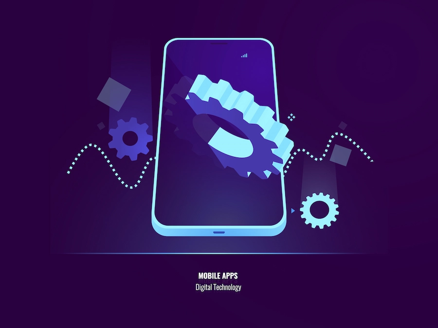
How Do I Optimize My Mobile Apps?
Apps need attention and optimization.
- Remove unused features
- Reduce memory usage
- Test on different phones
- Update regularly
- Enable offline mode (if possible)
Common Mobile Optimization Settings
What Is Optimization Mode?
It helps apps run better by using fewer resources. Helps reduce battery and memory use.
What Is Auto Optimize?
It automatically clears memory and stops unused apps to boost performance. Closes background apps and clears cache
Does Optimizing Apps Save Battery?
Yes. Especially for heavy apps. It can reduce power use and make your battery last longer.
Is App Optimization Good or Bad?
Mostly good, but sometimes it can limit app performance. Just ensure it doesn’t break features.
How Does Optimization Work?
You identify problems, make improvements, test the results, and repeat. It’s an ongoing process. It’s about making things better, step by step.
What Is the Optimization Problem?
In technical terms, it’s about finding the best solution with the least resources. For mobile, it’s about balancing performance, speed, and quality.
It’s a challenge to make something the best it can be fastest, cheapest, or most efficient.
Disadvantages of Mobile Optimization
Not everything is perfect.
Over-Optimization Risks
- Can lead to bugs or errors
- May break the layout
- Might limit creativity
Design Limitations
Small screens limit what you can show.
Higher Costs
Mobile optimization takes time, effort, and often money.
Advantages of Mobile Optimization
But the upsides are huge.
Enhanced Performance
Faster pages, better UX, and more user retention.
Competitive Edge
Most websites are still poorly optimized. Stand out.
Better User Engagement
Users stay longer, explore more, and convert better.
Mobile Optimization Benefits
- Higher search rankings
- Better conversion rates
- Improved customer loyalty
- Stronger brand perception
Great mobile experiences help you grow.
Higher Engagement and Conversions
Users stay longer and are more likely to buy or sign up.
Better SEO Rankings
Google rewards mobile-friendly sites with better search visibility.
Improved User Satisfaction
Users enjoy the experience. They come back.
Conclusion:
Mobile optimization is not just a trend—it’s a necessity. People use their phones all the time. If your mobile experience is poor, users will leave. But if you focus on speed, simplicity, and usability, you’ll keep users happy—and engage.
If your website or app doesn’t work well there, you’re losing business. Start by testing your site. Fix what’s broken. Keep improving.
Great mobile experiences build trust, increase engagement, and drive growth. Start optimizing today.
Frequently Asked Questions
Frequently Asked Questions for ” Mobile Optimization for Better User Engagement “
Why is Optimization Used?
It helps improve performance. That means faster speed, better user experience, and more conversions.
What Are the 5 Steps of Optimization?
- Audit your current setup
- Set clear goals
- Make changes
- Test results
- Repeat to improve
What Is the First Rule of Optimization?
Don’t optimize what doesn’t matter. Focus on what improves user experience.
How to Check Mobile Optimization
Use tools like:
- Google PageSpeed Insights
- GTmetrix
- Lighthouse in Chrome DevTools
- Google’s Mobile-Friendly Test
- Google Search Console (Mobile Usability section)
Mobile Optimized Meaning
It means your content loads quickly, looks good, and is easy to use on a phone.


https://mazda-demio.ru/forums/index.php?autocom=gallery&req=si&img=6624
https://mazda-demio.ru/forums/index.php?autocom=gallery&req=si&img=6599
https://myteana.ru/forums/index.php?autocom=gallery&req=si&img=6609
https://vitz.ru/forums/index.php?autocom=gallery&req=si&img=5109
https://myteana.ru/forums/index.php?autocom=gallery&req=si&img=6702
https://hrv-club.ru/forums/index.php?autocom=gallery&req=si&img=6953
http://terios2.ru/forums/index.php?autocom=gallery&req=si&img=4810
https://vitz.ru/forums/index.php?autocom=gallery&req=si&img=4915
https://mazda-demio.ru/forums/index.php?autocom=gallery&req=si&img=6495
http://terios2.ru/forums/index.php?autocom=gallery&req=si&img=4552